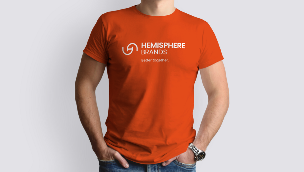
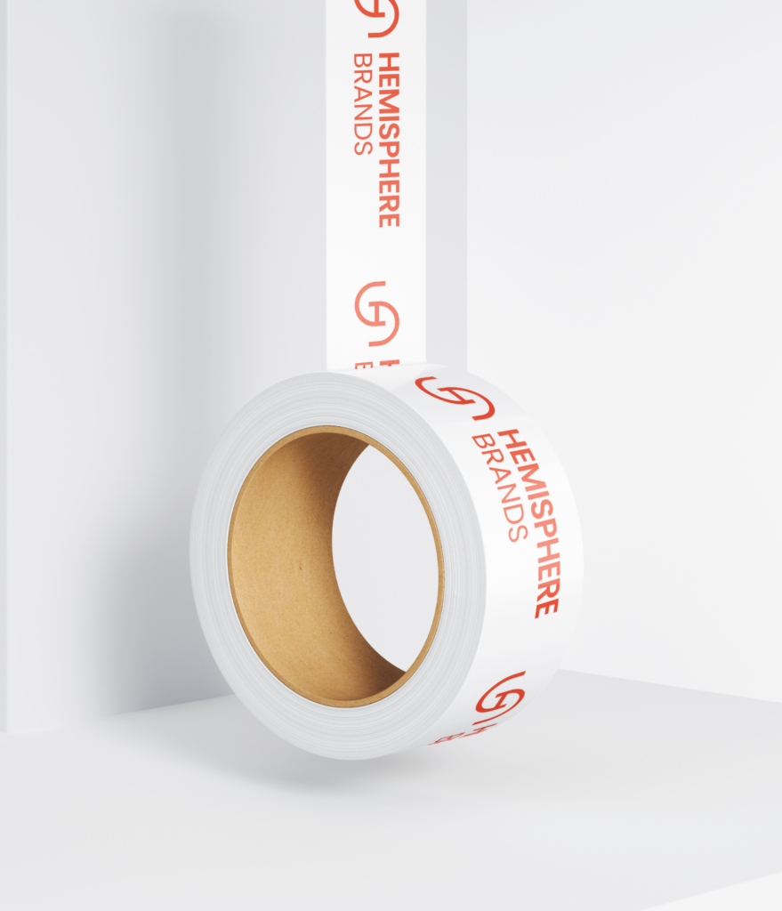
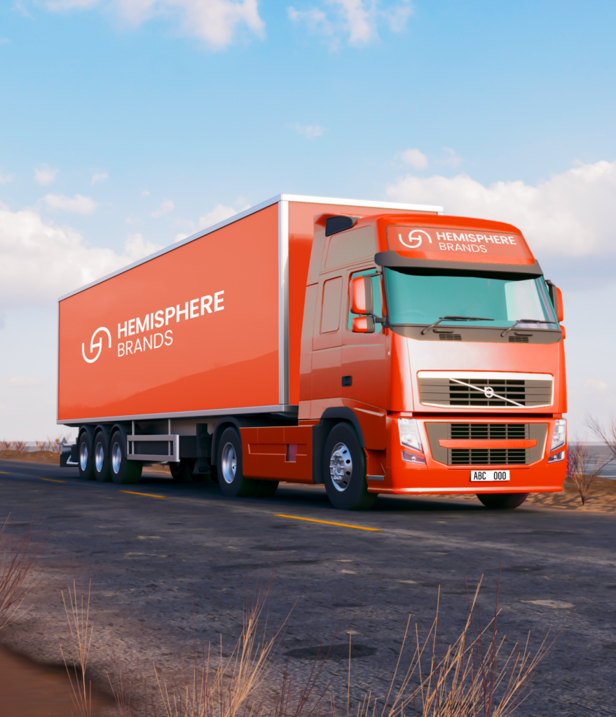
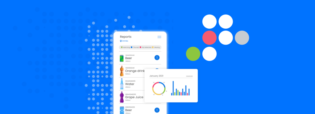
An exclusive world of brands for the US home & garden market

Challenge
Hemisphere Brands wanted to tell a stronger, clearer, and more compelling story about their belief that great retail brands need great consumer brands—and that both need the right partner to succeed. The challenge was making sure this message felt authentic and resonated with their audience, while standing out in a competitive industry.
Solution
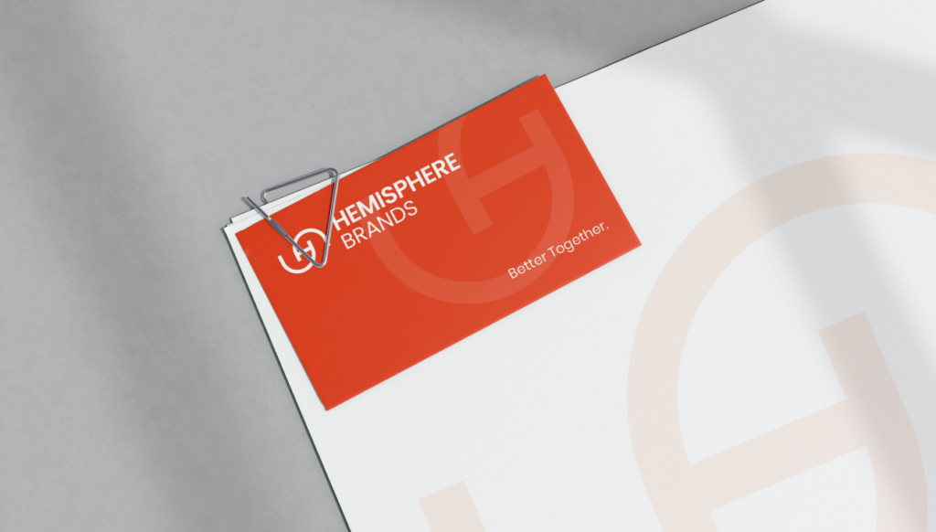
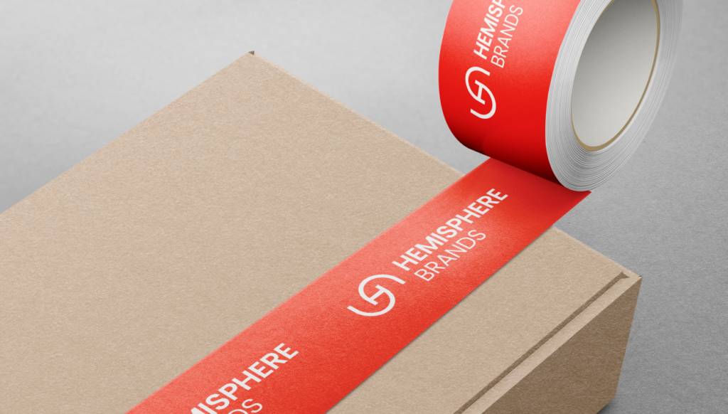
We teamed up with Hemisphere Brands to create a brand identity and website that truly reflects their vision and values. By gathering insights from their team and partners in our in-site visit to the US, we were able to craft a story that highlights their unique approach. The result is a brand identity that feels fresh and approachable, along with a website and marketing materials that showcase their commitment to connecting retail and consumer brands in the best possible way.
Brand Creation
Web Design
UX/UI Design
Development

Discover More Projects

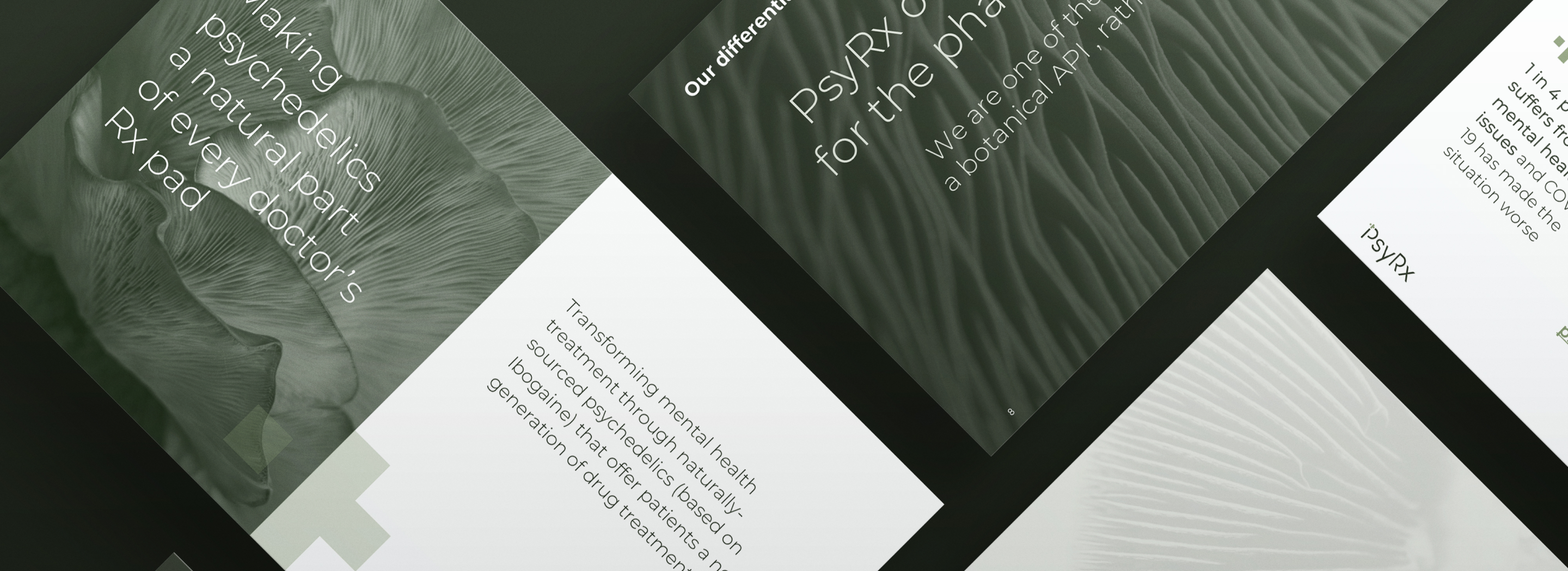
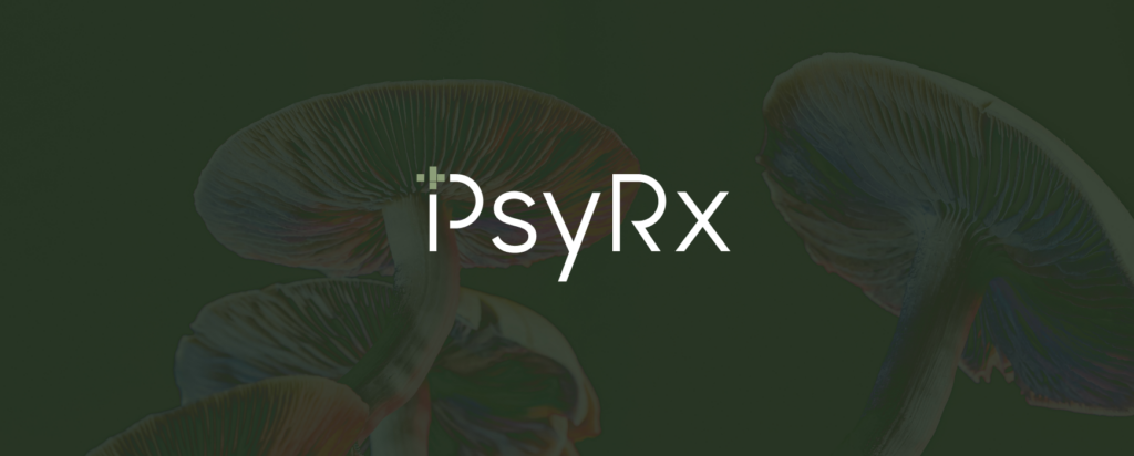
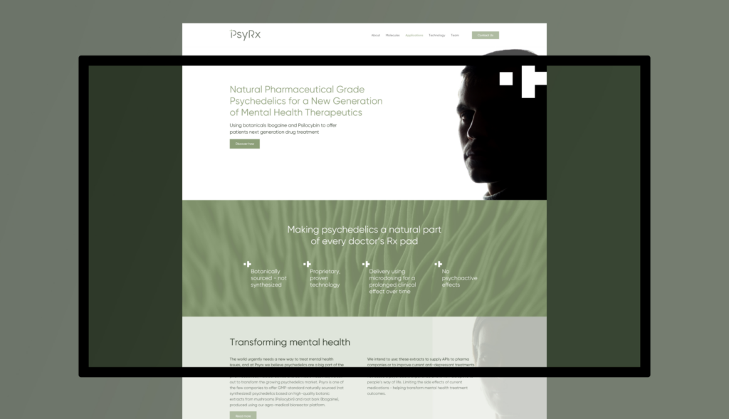
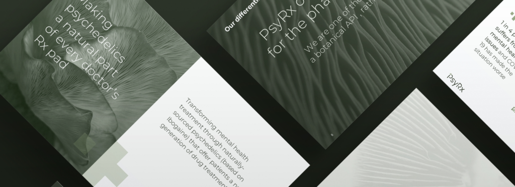
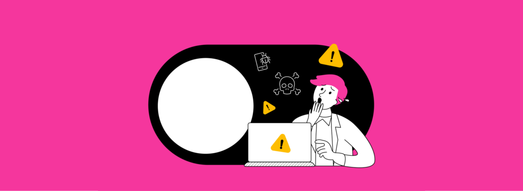
Making psychedelics a natural part of every doctor’s Rx pad
Challenge
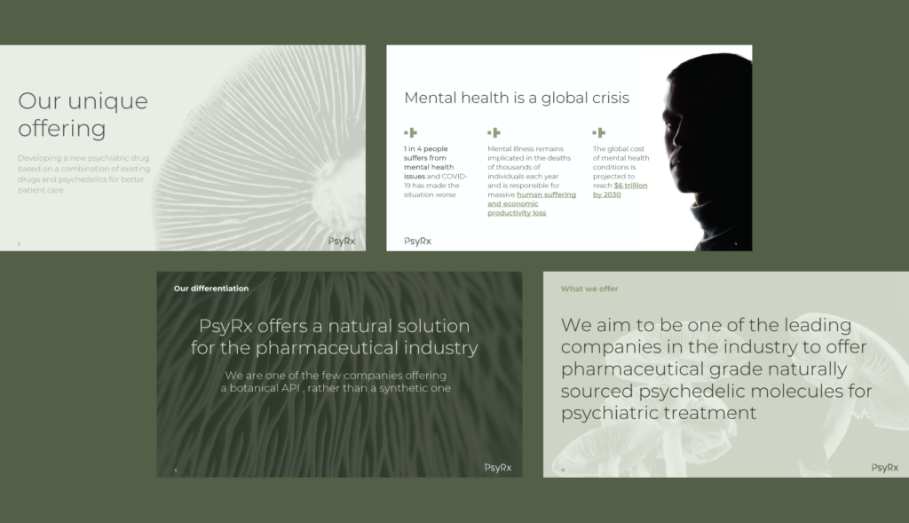
Our branding challenge was to craft a strategy that not only elevated awareness of our pharmaceutical innovations but also captured the attention of potential investors. We needed to develop a distinct brand identity that effectively communicated our cutting-edge solutions and market potential, positioning the company as a leader in the mental health treatment through naturally-sourced psychedelics industry while building investor confidence and interest.
Solution
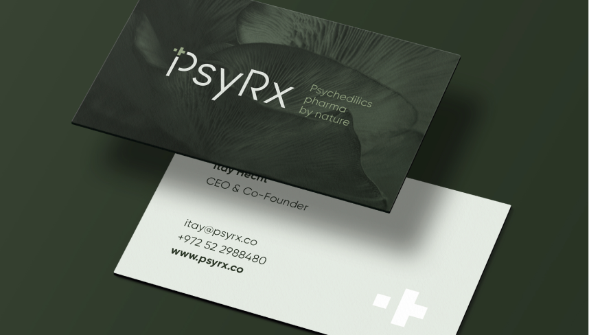
We positioned the brand as the leader in natural pharma-grade psychedelics, paving the way for a new generation of mental health therapeutics. Our work included creating a distinctive visual identity, including a new logo and color palette, and producing key materials like a website and marketing collateral.
Brand Creation
Web Design
Built around the promise of being “Naturally better,” the focus was on achieving improved mental health outcomes through meticulously sourced psychedelic APIs derived from nature. The visual language reinforced this narrative with a clean, light, and clear design, merging the precision of a tech-forward, pharma aesthetic with the calming essence of natural elements. This blend not only underscored the brand’s innovative edge but also aligned with the ethos of delivering safe, effective, and naturally inspired solutions for mental well-being.
We established a brand identity that highlighted the company’s commitment to natural, effective alternatives

Discover More Projects
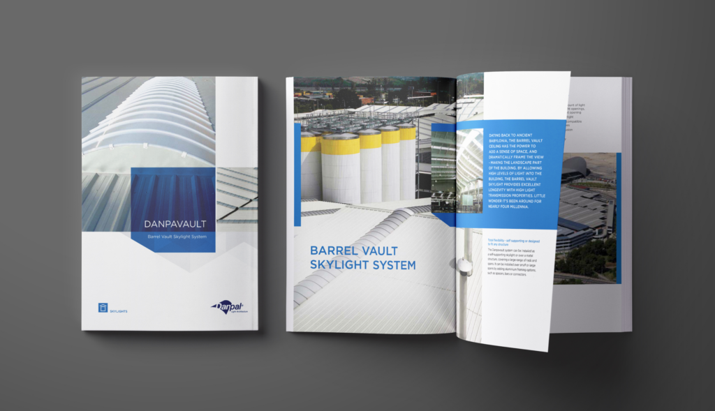
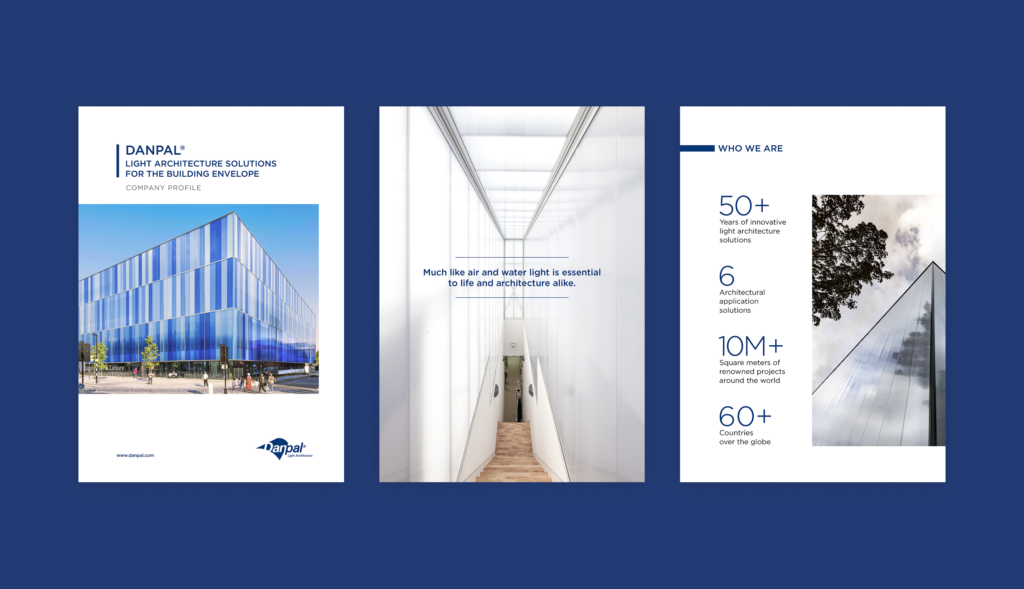
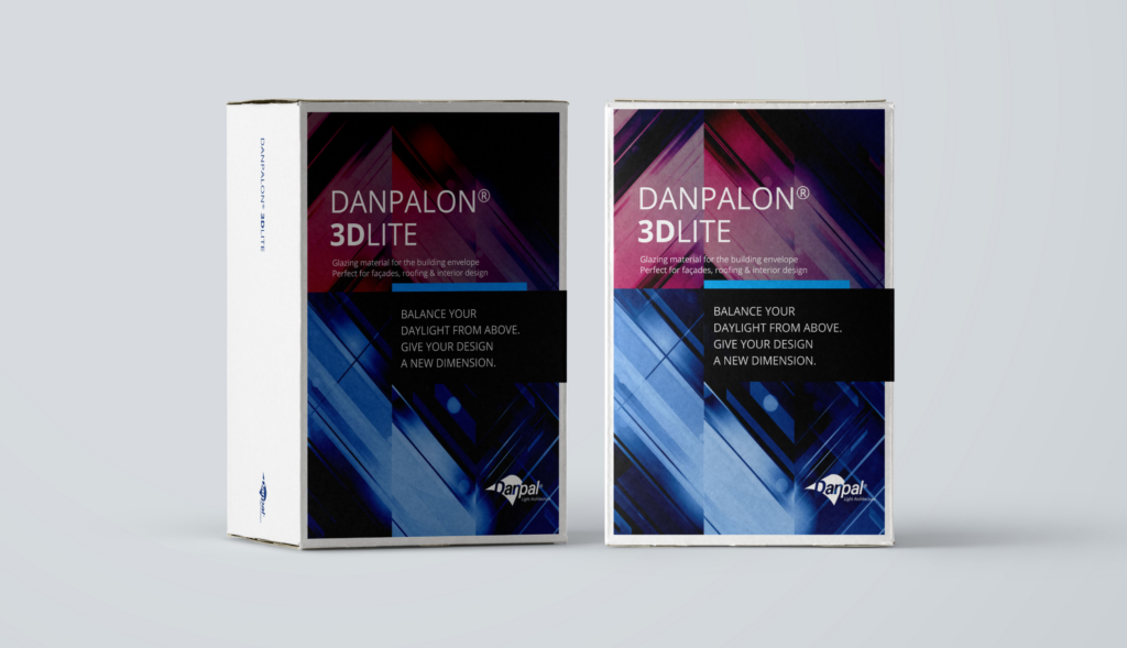
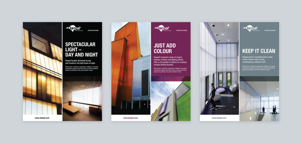
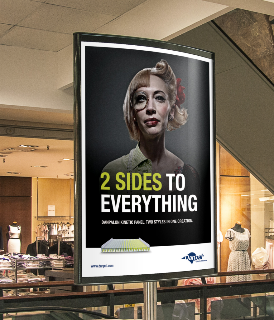
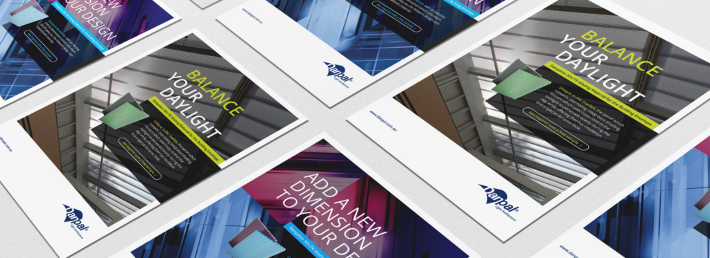
Illuminating Light Architecture Solutions

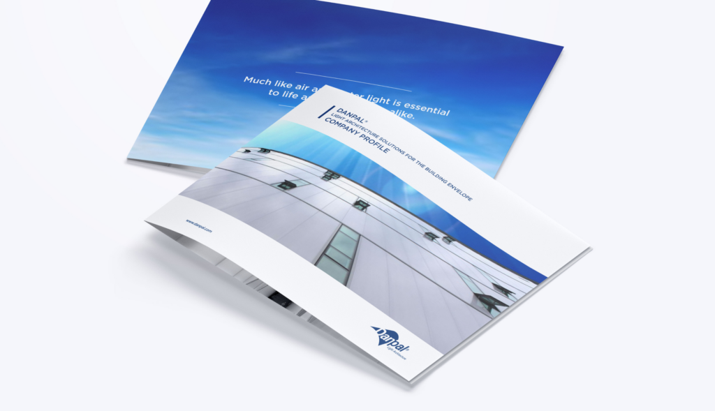
For over 50 years, Danpal has been a global leader in natural daylight solutions for architectural applications. Their innovative polycarbonate systems for facades, roofs, cladding, and shading enable architects to design energy-efficient buildings that meet Green Building standards, seamlessly integrating natural light into architecture.
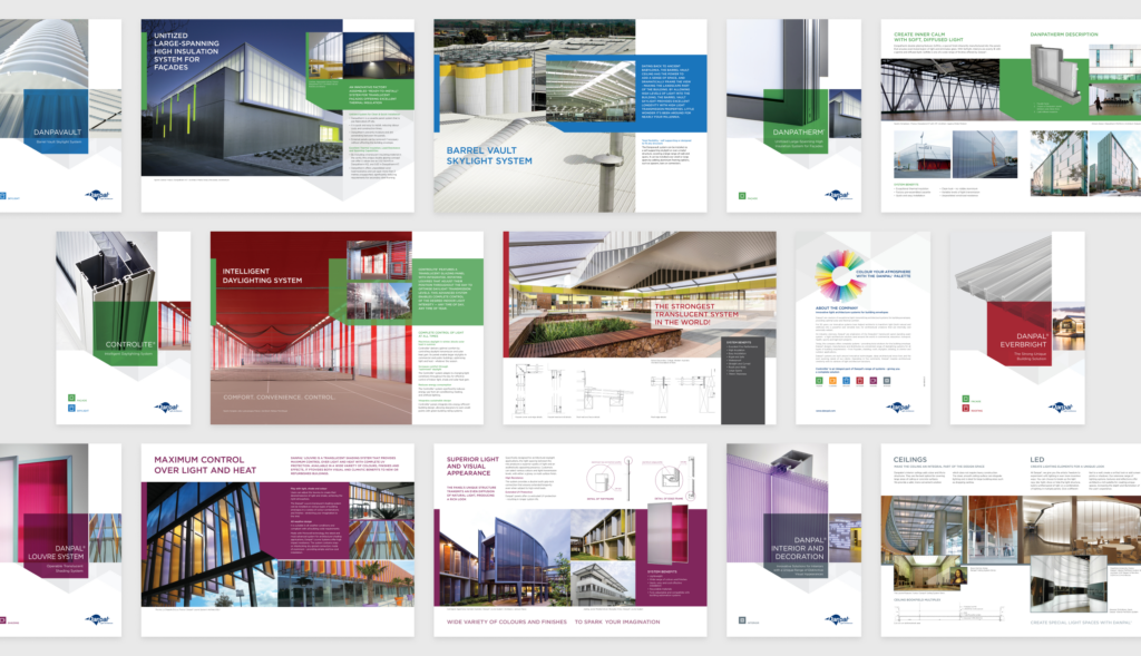
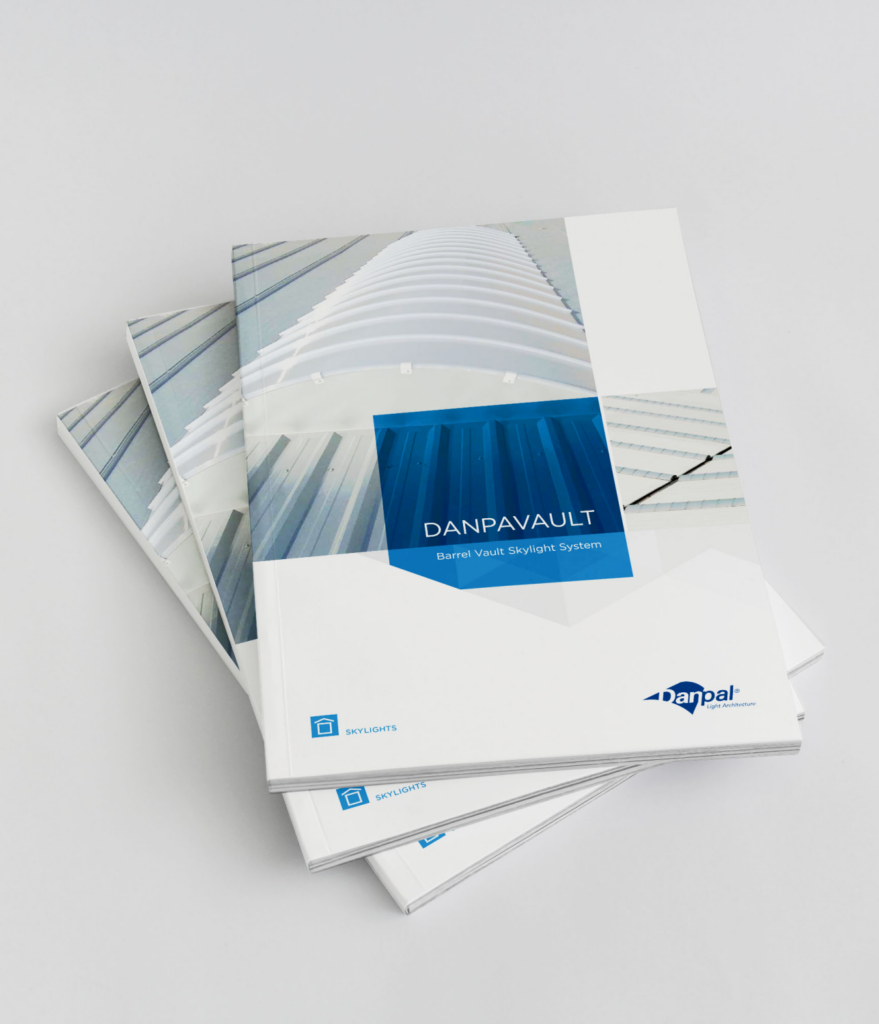
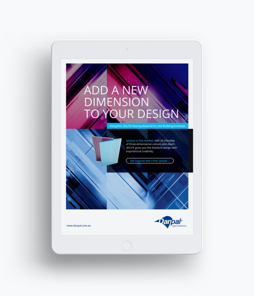
We’ve partnered with Danpal for years, supporting their vision through a wide mix of creative projects. From branding and marketing materials to product brochures, booth designs, packaging, social media, and their website, our collaboration has played a key role in shaping how they present their groundbreaking solutions to the world. Our work goes beyond design—it’s about bringing Danpal’s vision to life. Their tailor-made daylighting solutions inspire architects with creative possibilities and uphold the highest standards of quality. Through our designs, we’ve showcased their commitment to sustainability, innovation, and elevating architecture with natural light.
Brand Creation
Web Design
UX/UI Design
Exhibitions & Events
Building Envelope Solutions
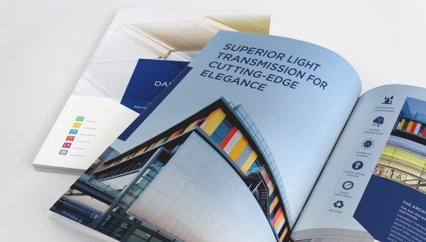
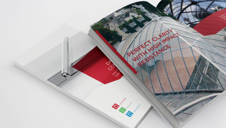
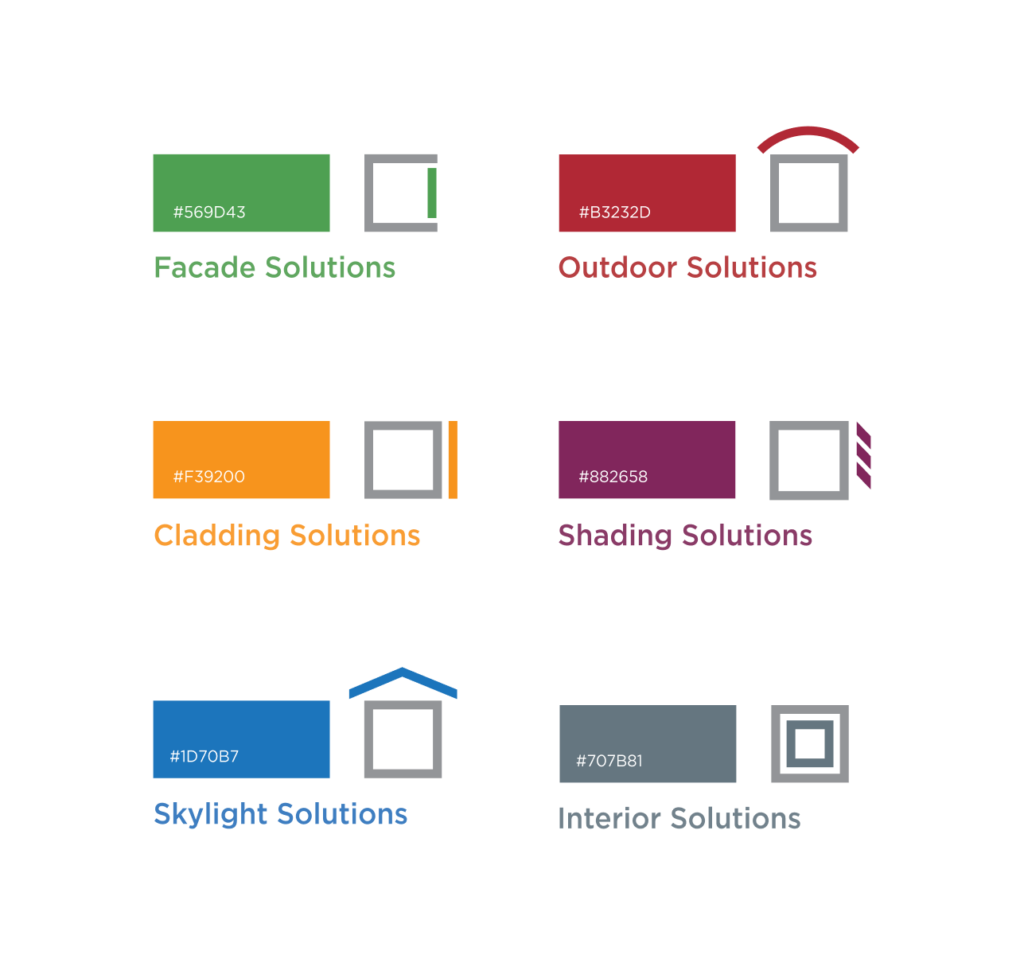
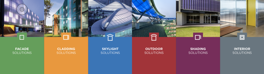
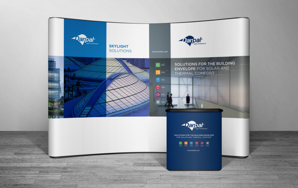
Danpal: Icon & Color System
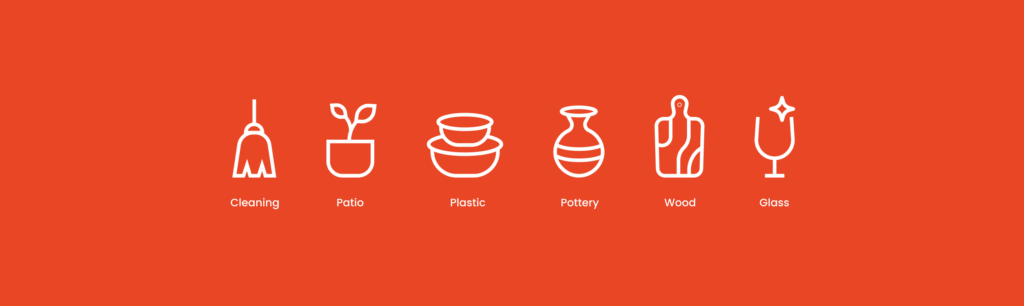
To enhance Danpal’s architectural applications, we developed a distinctive icon and color system that highlights their solutions while reinforcing brand identity. This visual language is both cohesive and intuitive for architects and designers. Each category features a custom icon reflecting its function—like a square for facade panels, a curved arch for the protective nature of outdoor solutions, and a house shape for skylights, representing openness and light.
We assigned distinct colors to each category for easy recognition: Green for Facades, red for Outdoor Solutions, orange for Cladding, purple for Shading, blue for Skylight Solutions, and gray for Interiors. This strategic approach enhances brand recognition while providing a clear framework for Danpal’s daylighting solutions, aligning with their commitment to quality, creativity, and clarity.
Discover More Projects
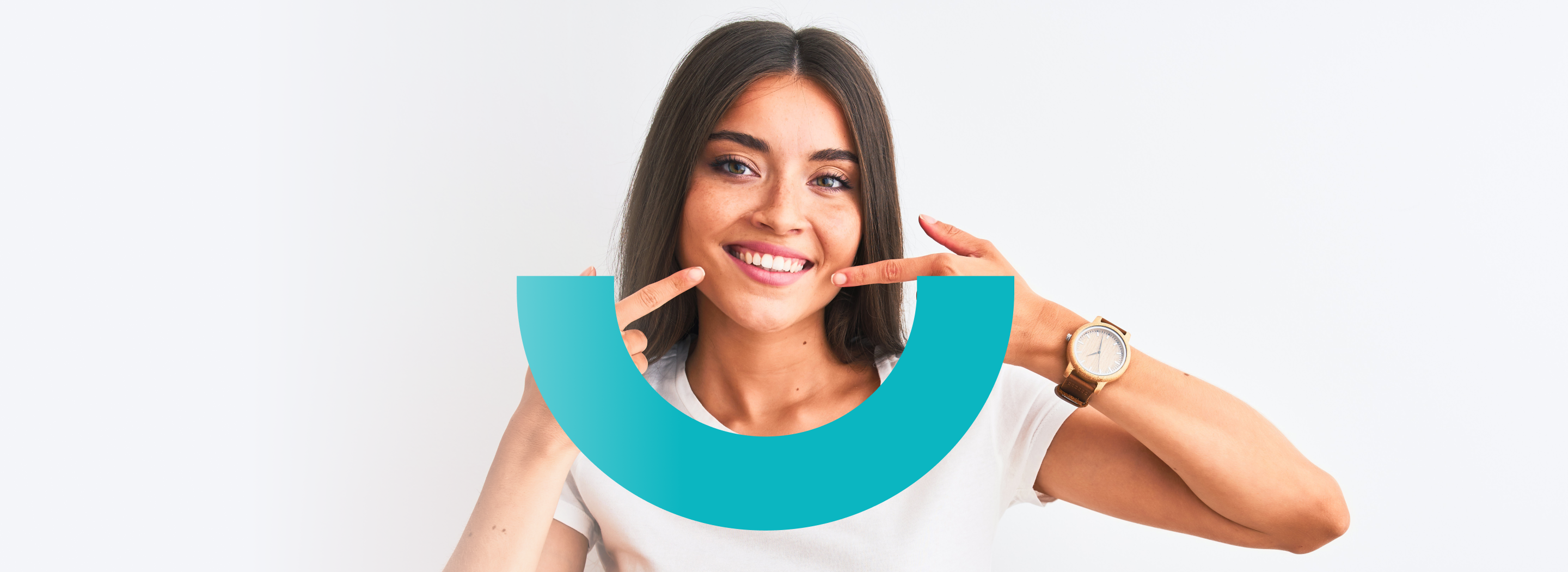
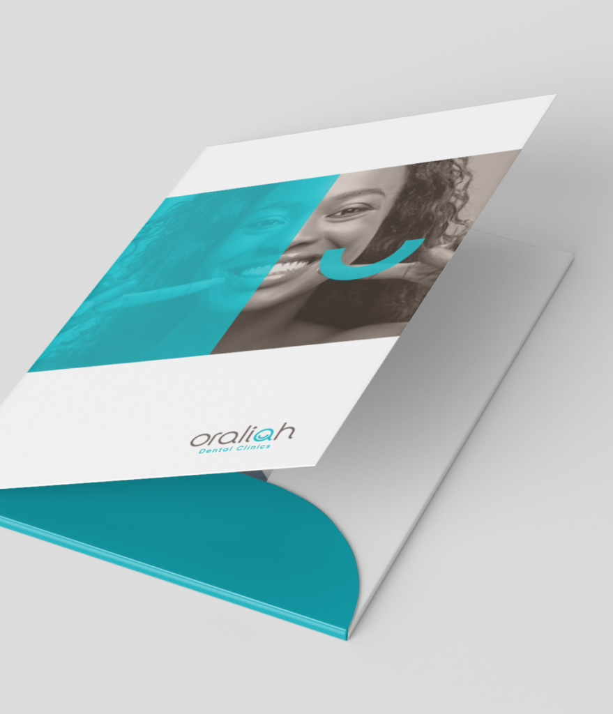
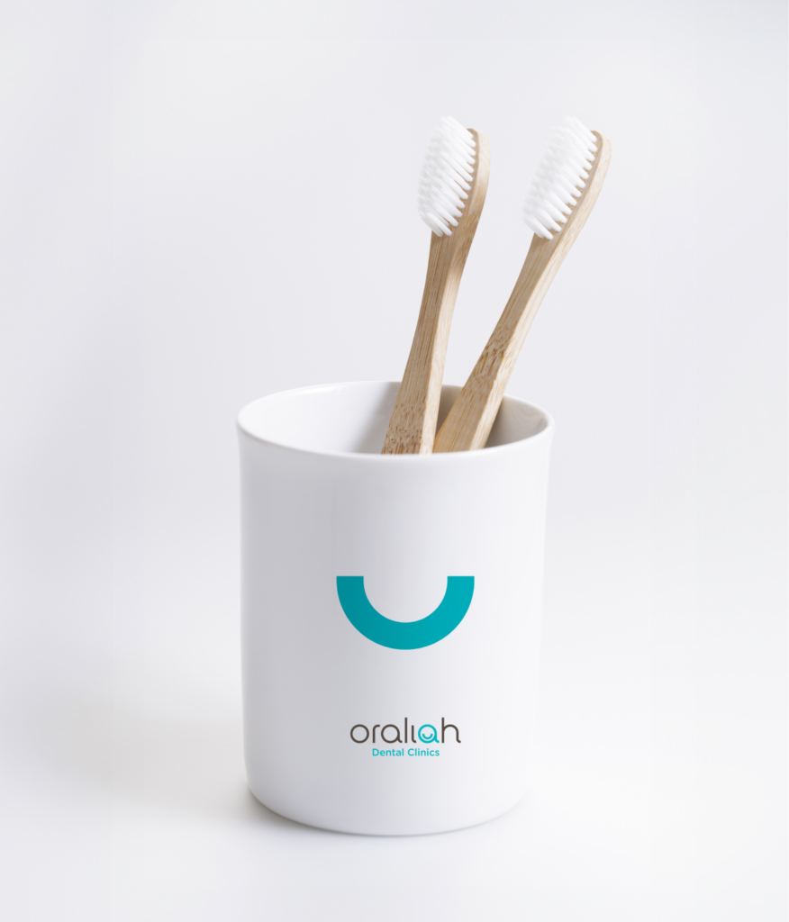
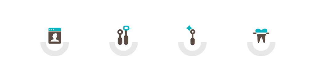
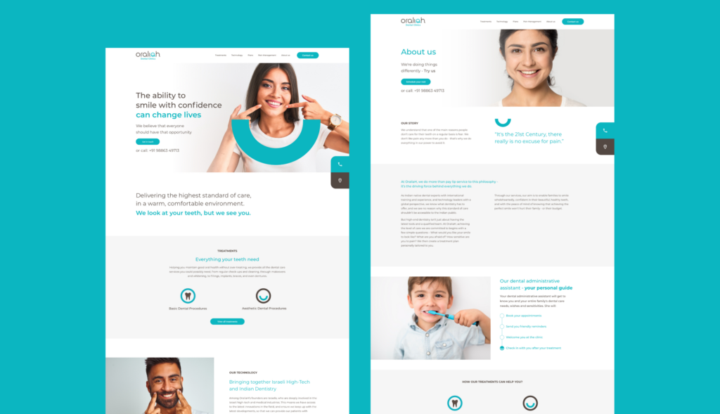
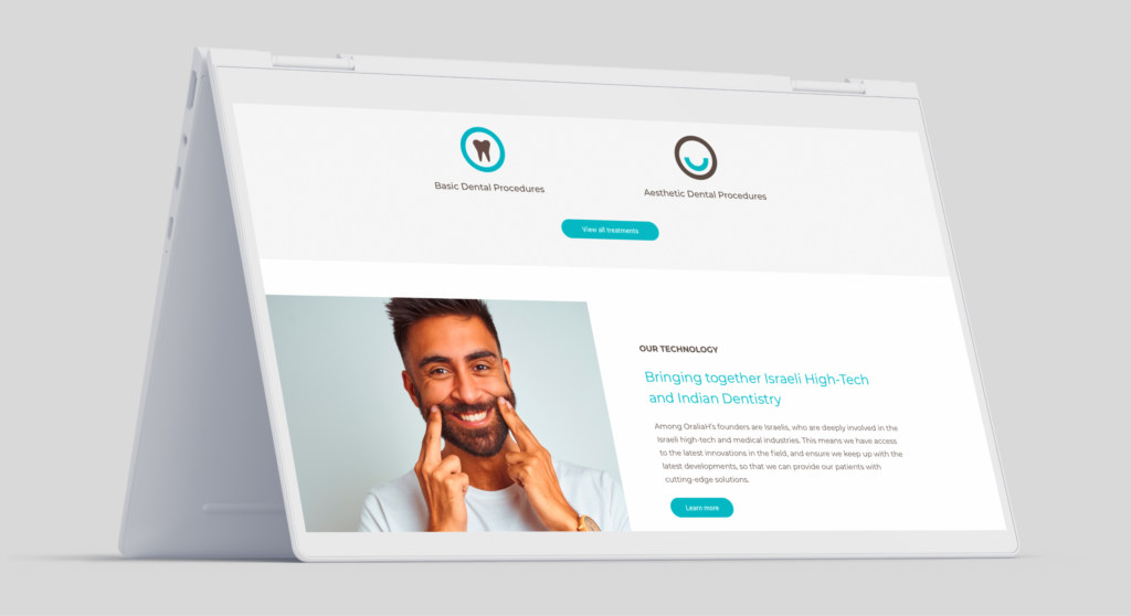
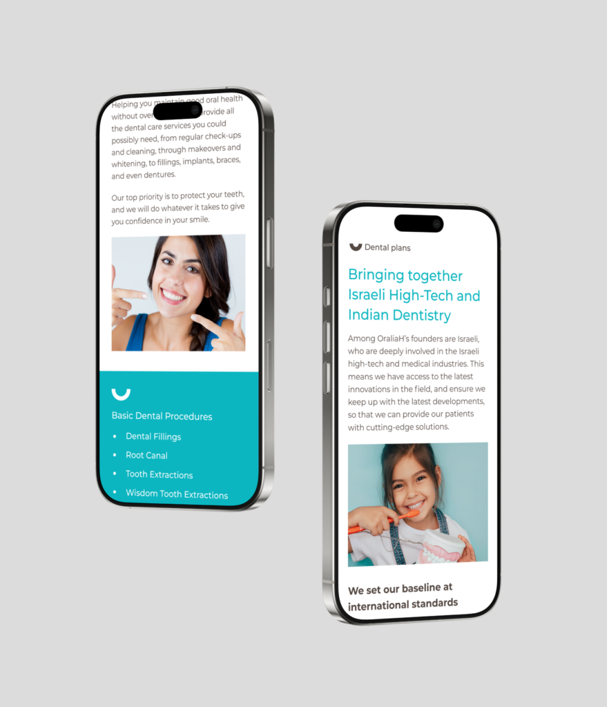
Smile with Confidence
Challenge
Oraliah needed to communicate their commitment to high-quality dental care while standing out in a competitive market. They aimed to highlight their unique blend of Israeli high-tech innovations and Indian dentistry expertise. The challenge was to design a brand identity and website that conveyed trust, warmth, and professionalism while emphasizing their cutting-edge technology and diverse range of services.
Solution
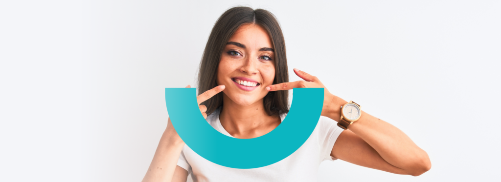
We created a cohesive brand identity for Oraliah, including a visual concept, website UX/UI, and marketing materials. The core concept was built around the idea of a smile—incorporating a half-circle element in the imagery to visually represent the transformation and confidence that a smile brings. The website design itself was crafted with user experience in mind, ensuring that visitors could easily explore Oraliah’s wide range of services. The design balanced warmth and professionalism, highlighting their innovative use of Israeli high-tech and Indian dentistry. This seamless integration of concept and design made the website engaging and user-friendly, while reinforcing Oraliah’s commitment to providing high-quality dental care.
Web Design
UX/UI Design

Discover More Projects
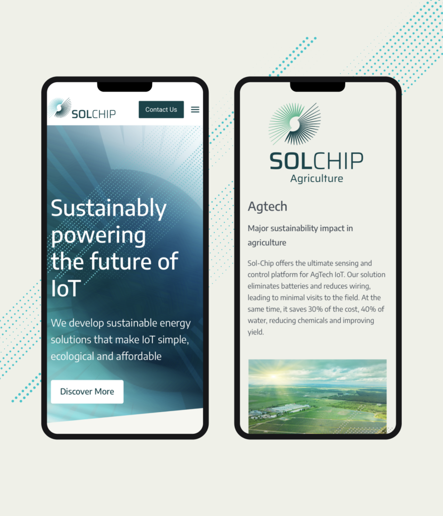
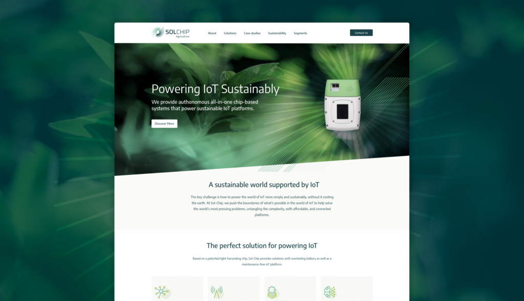
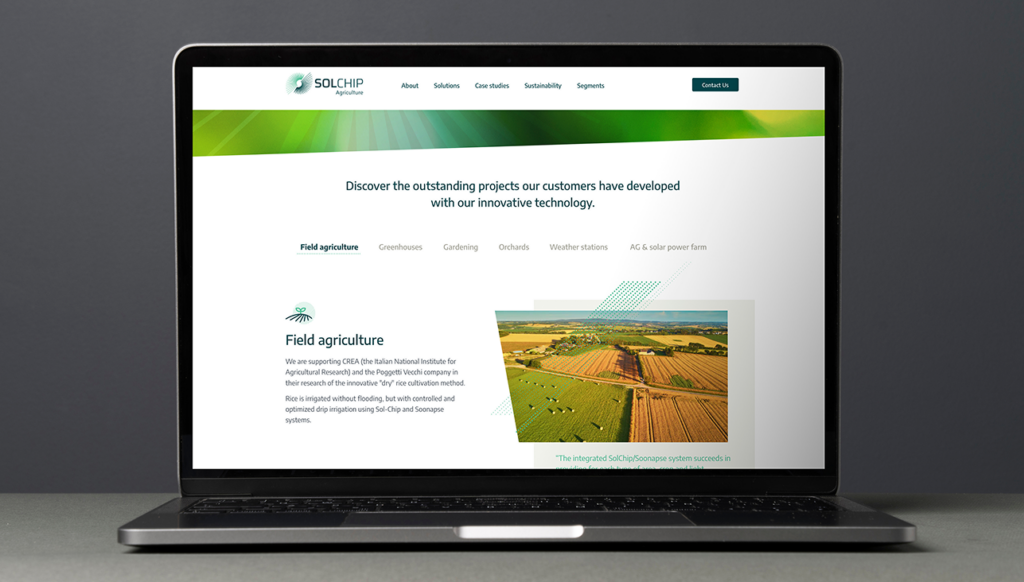
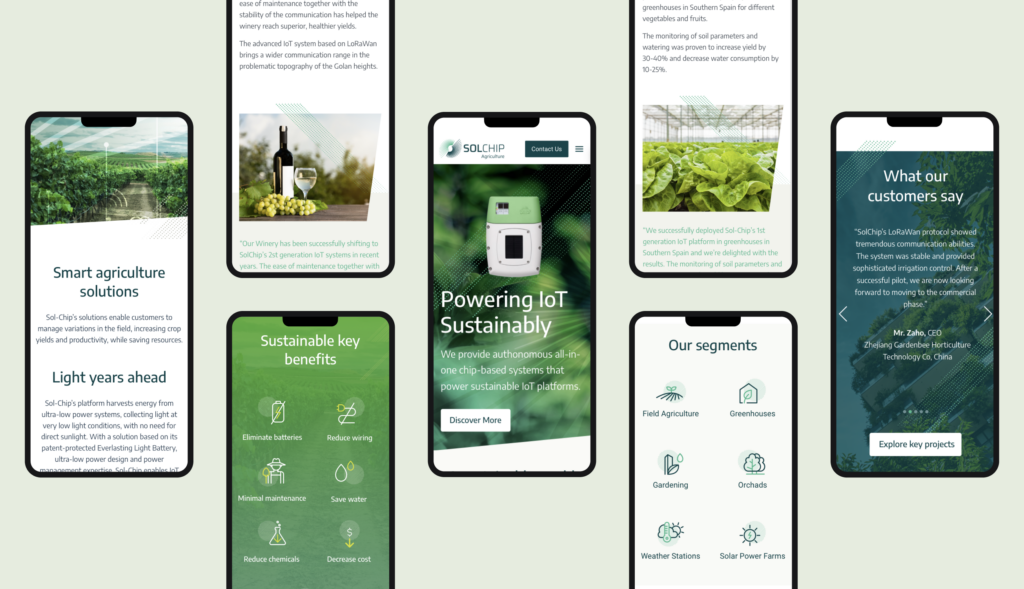
Sustainably powering the future of IoT
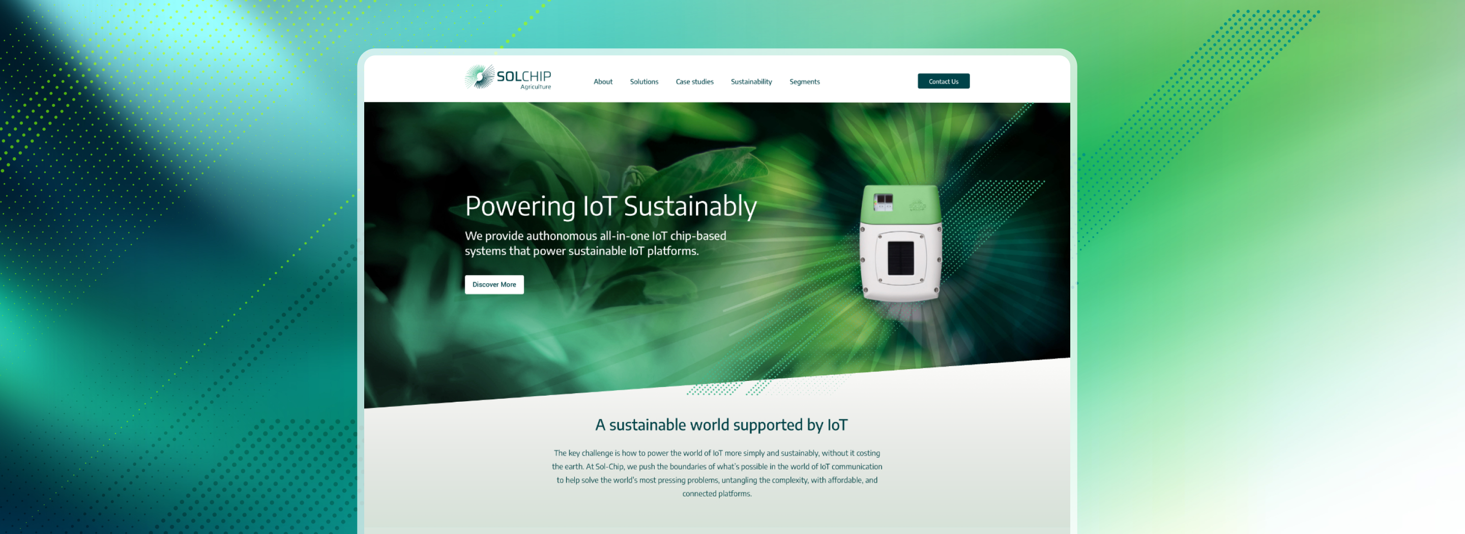
Challenge
Solchip, a leader in autonomous, solar-powered IoT solutions, needed a digital presence that effectively communicated its cutting-edge technology. The challenge was to create a unified UX/UI design for both its corporate website and Solchip Agriculture, ensuring a seamless user experience while distinguishing the two brands. The project required a visual language that conveyed innovation, sustainability, and reliability while appealing to both industrial and agricultural markets.
Solution
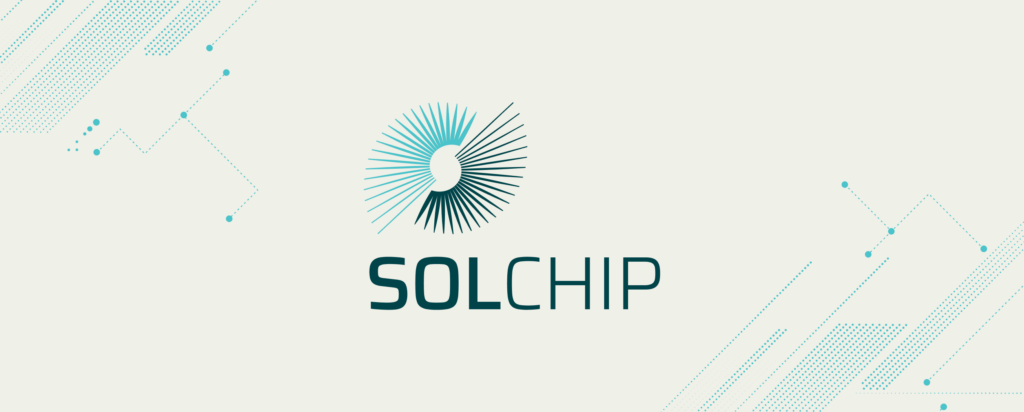
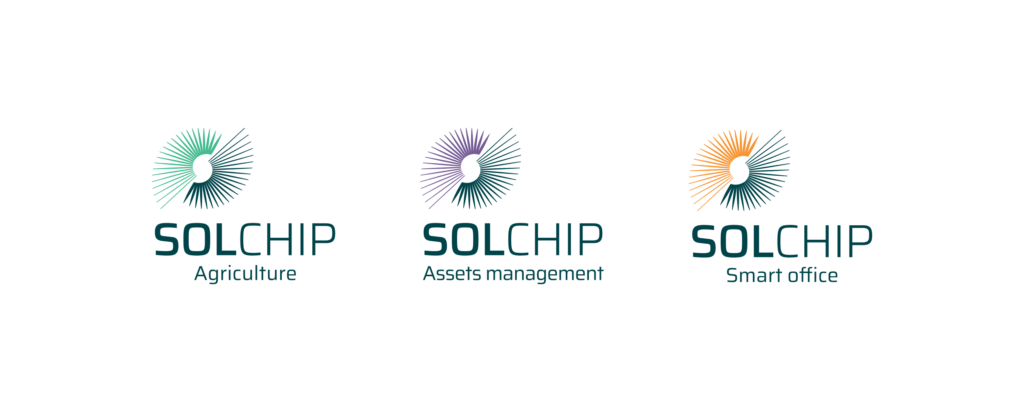
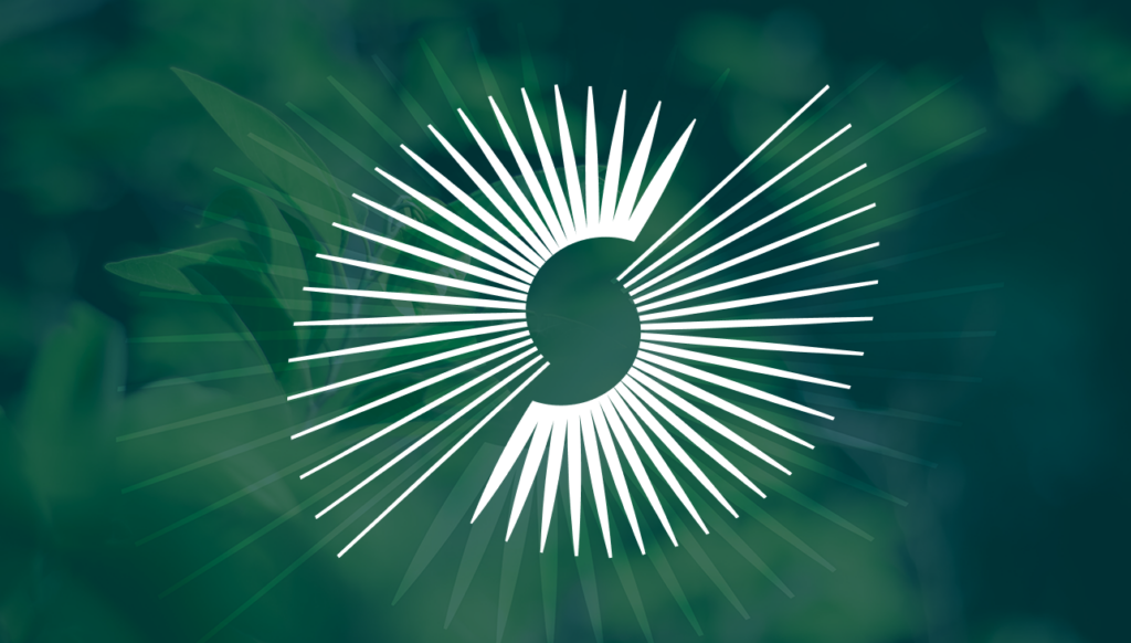
We developed a modern, intuitive UX/UI for Solchip’s website and landing pages, ensuring clarity in messaging and seamless navigation. To carry the brand idea, we developed a visual language that embodies autonomy, efficiency and seamless connectivity – key attributes of IoT and solar-powered technology. We also designed distinctive logos for SolChip and its sub-brands, including SolChip Agriculture, Smart Office, and Asset Management. We used different colors in the logos (blue for the Solchip brand and green for Agriculture, purple for Assets Management and Orange for Smart Office ) to differentiate the product lines.
Web Design
UX/UI Design
Development
Renewable Energy
Discover More Projects
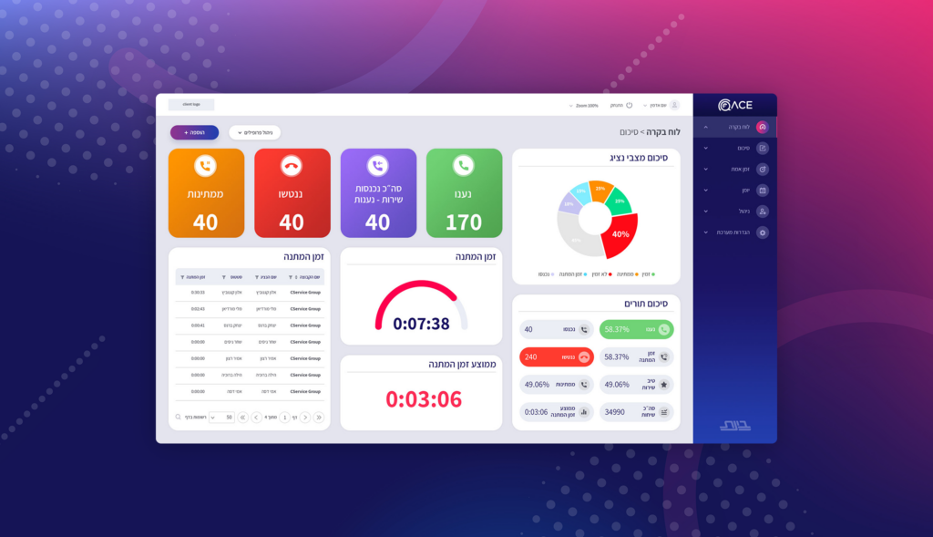
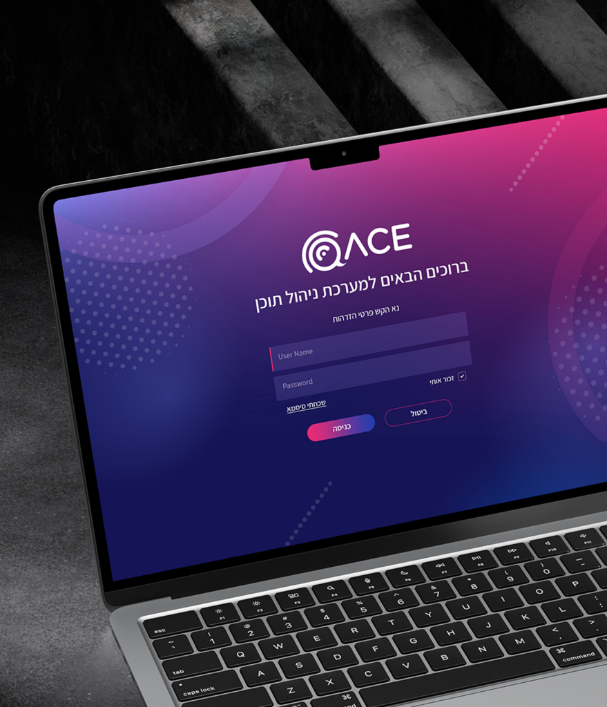
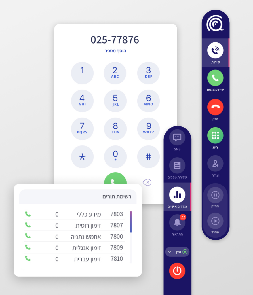
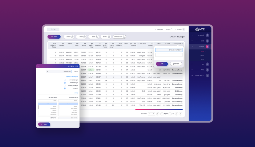
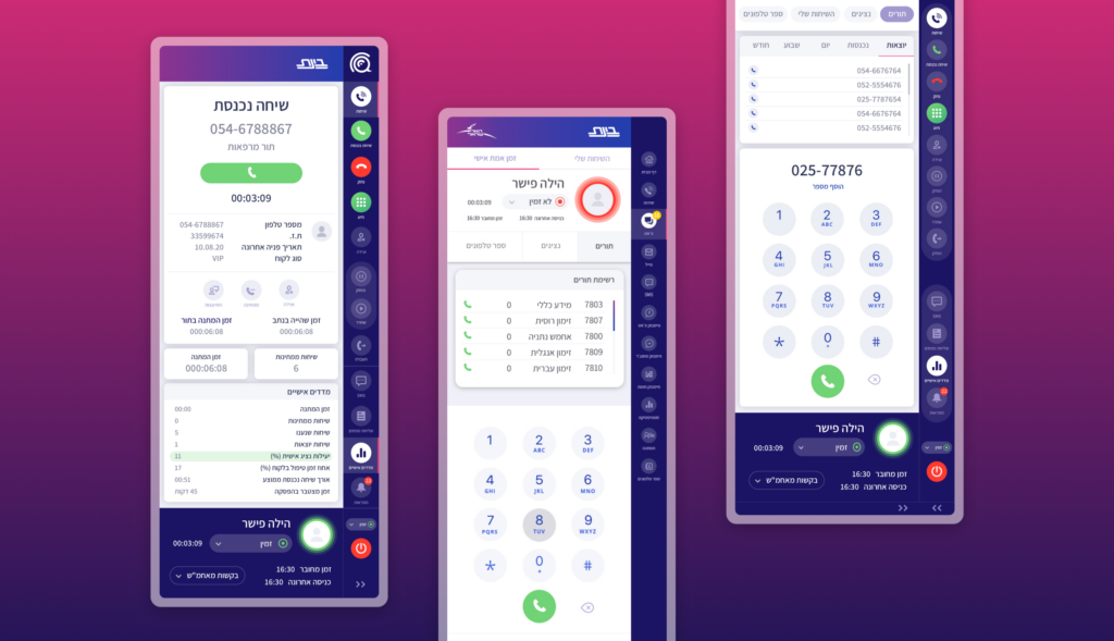
Smarter Interface for Real-Time Call Center Management
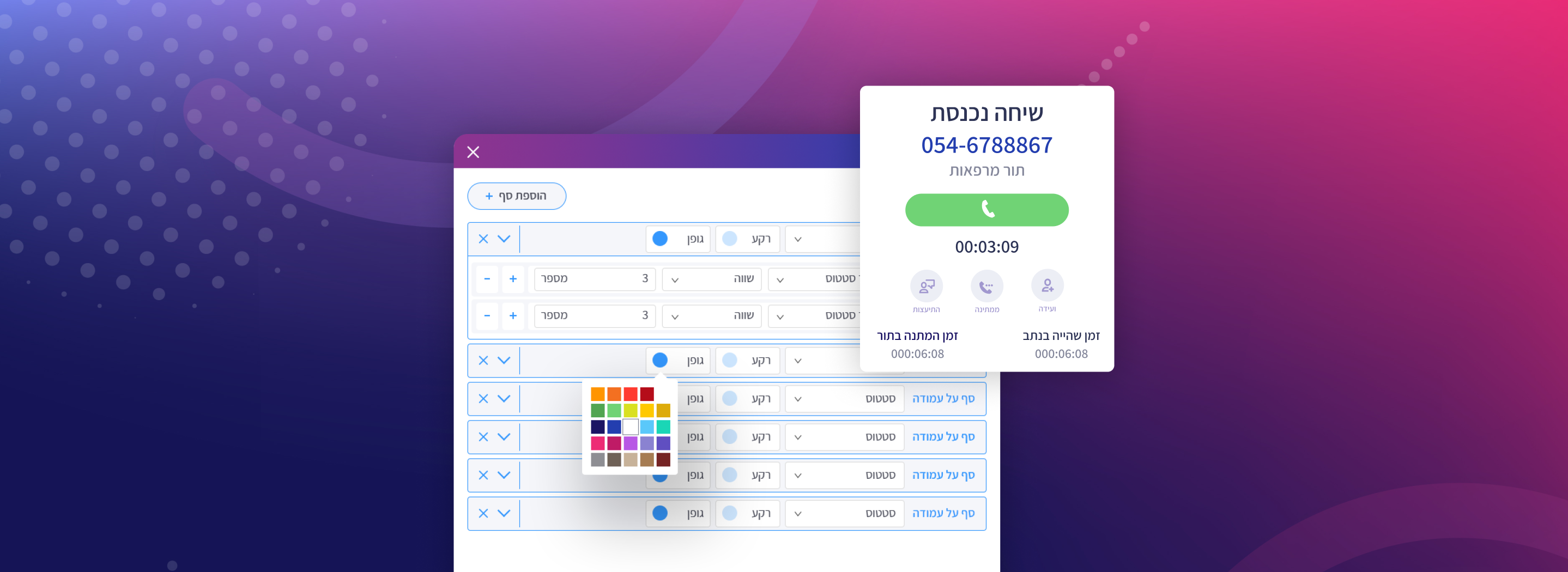
Challenge
Bynet, a leading provider of end-to-end integration solutions and services, needed to upgrade the look and feel of the ACE logo and dashboard.
Solution
We crafted a dynamic and intuitive UI/UX design for the real-time response dashboard, enhancing functionality and user engagement for the call center. Additionally, we revitalized the ACE logo, giving it a fresh, modern edge that aligns with the brand’s evolving identity.
Product Design
App UX/UI
IT & Telecommunications
Discover More Projects
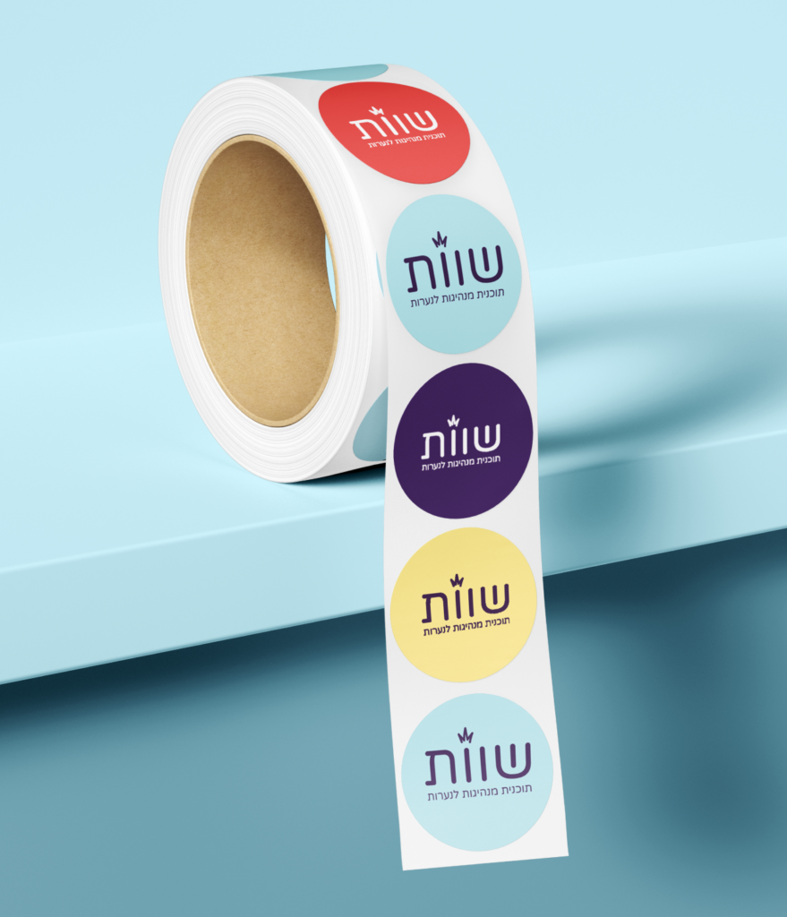
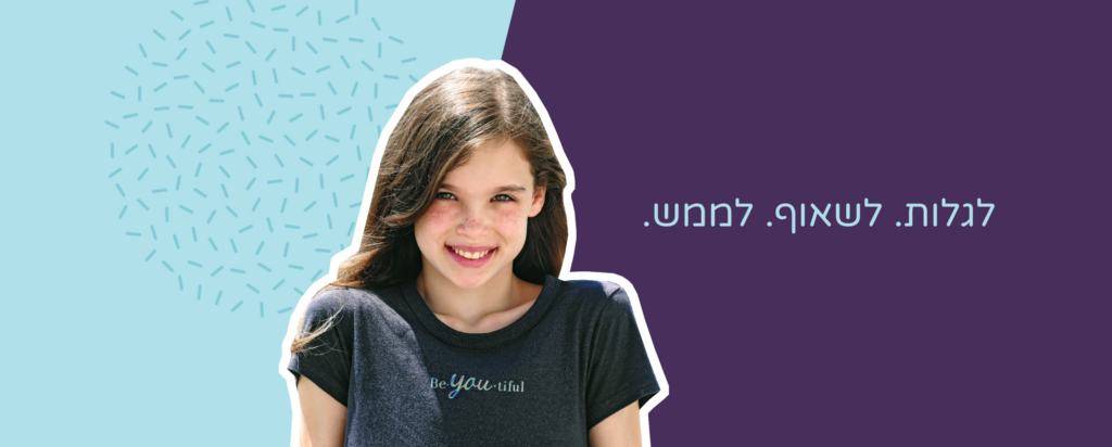
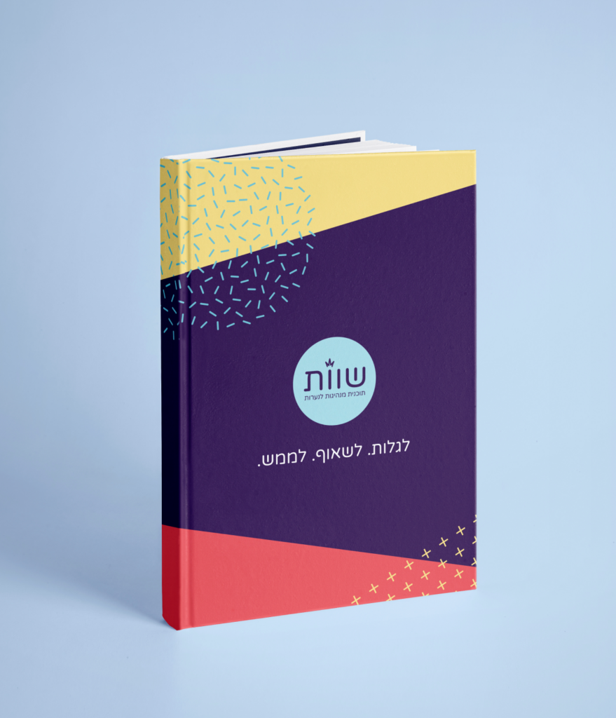
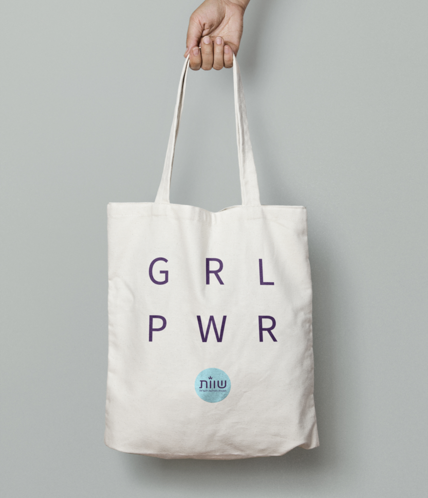
Discover. Aspire. Achieve.
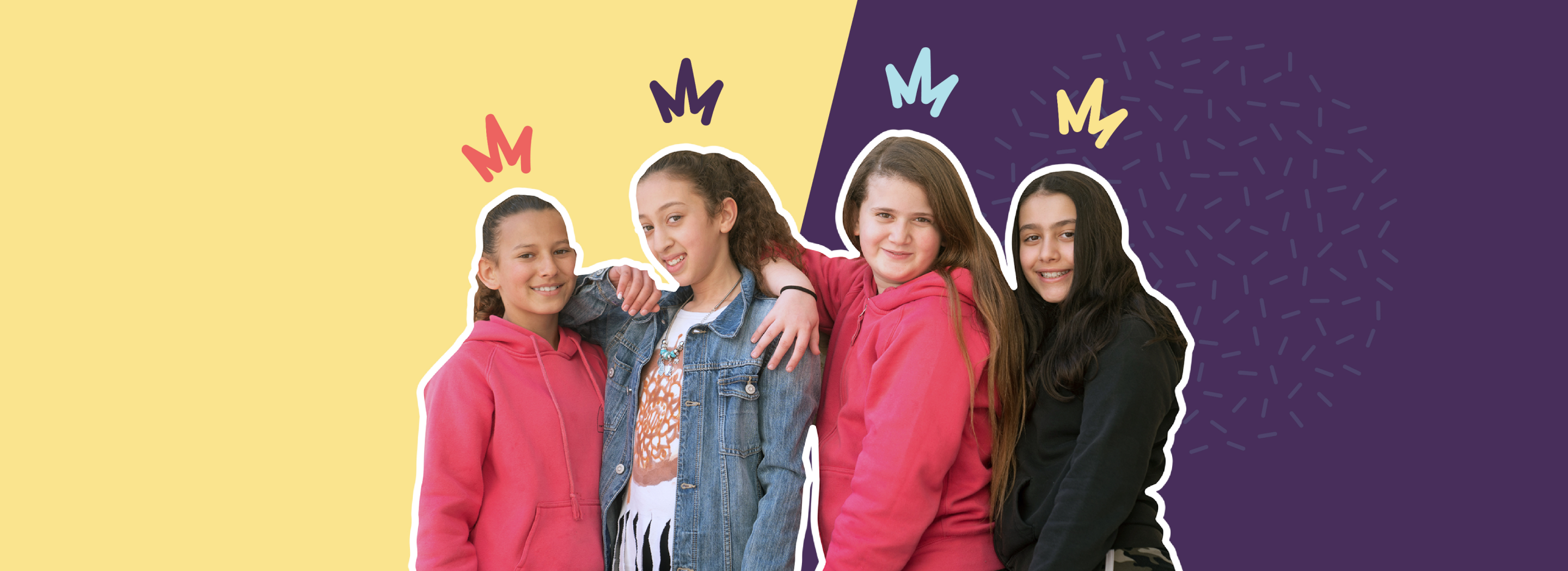
Challenge
The Shavot Association was founded to close gender gaps and empower girls by boosting their confidence and equipping them with the tools to achieve their full potential. They needed a strong and engaging visual identity that would resonate with while maintaining credibility with educators, mentors, and stakeholders. The brand had to strike a balance between being youthful, inspiring, and empowering—encouraging young girls to see themselves as future leaders while ensuring the organization’s mission was taken seriously.
Solution
With deep personal involvement in the organization, as our founder Meirav Tal served as a board member at Shavot, we understood the importance of creating a brand that could speak directly to young girls. We designed a vibrant and approachable visual language that immediately captures the attention of young girls. The color palette, typography, and design elements were carefully selected to be playful yet empowering, creating an inviting atmosphere that encourages participation. At the same time, we ensured that the branding remained professional and impactful for a broader audience, reinforcing Shavot’s mission of fostering confidence, leadership, and self-belief in young girls nationwide.
Brand Creation
Exhibitions & Events
Illustrations
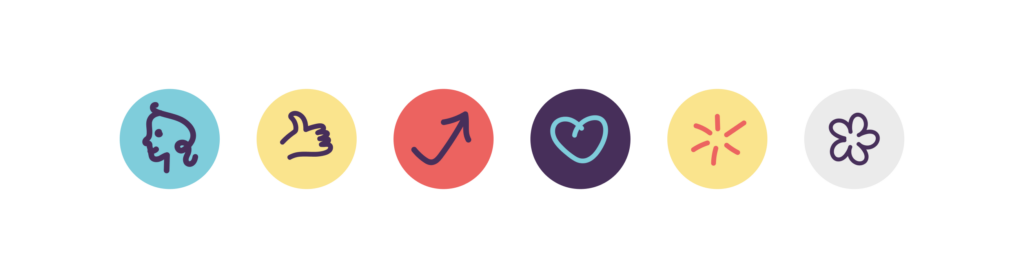
The sticker design features a collection of playful and empowering icons, making leadership and self-confidence feel fun and approachable. Bright colors and dynamic shapes create an engaging visual language that encourages creativity and self-expression. Each icon symbolizes key values of the Shavot Association, inspiring young girls to dream big and embrace their strengths.
Discover More Projects
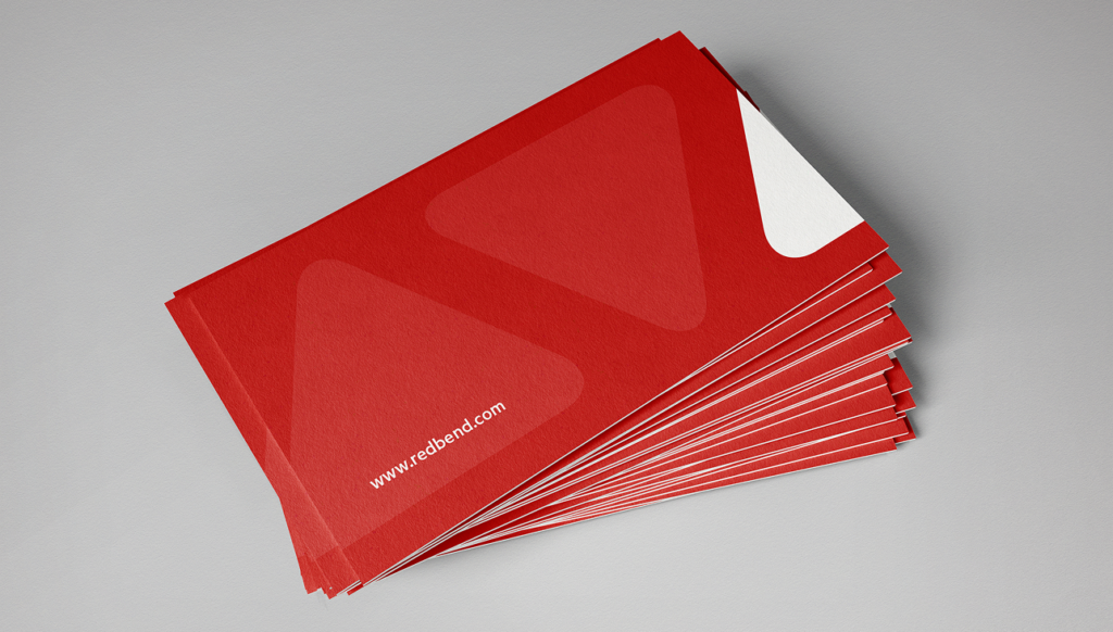
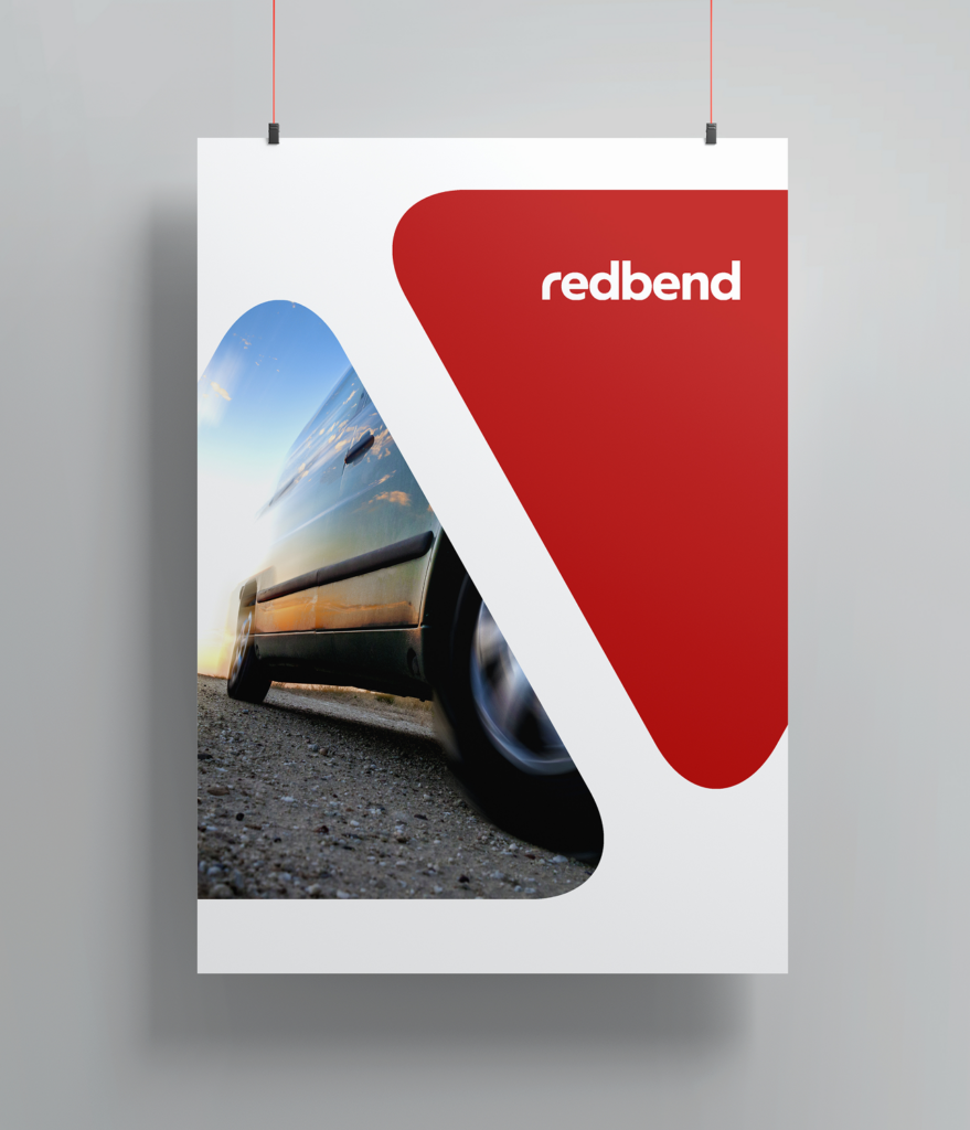
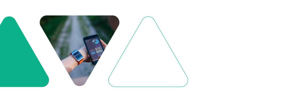
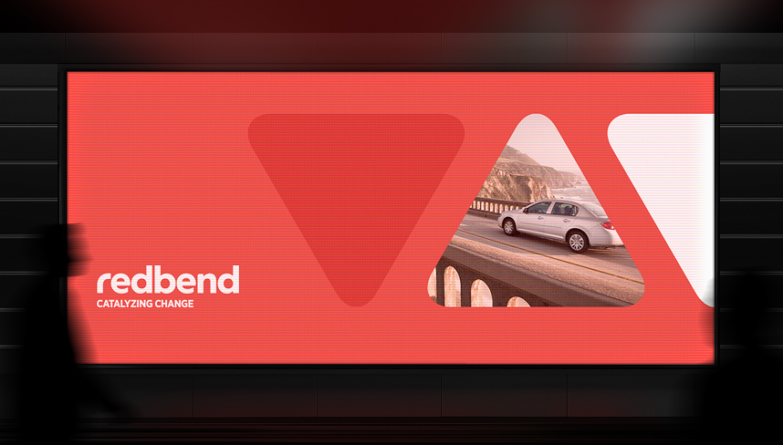
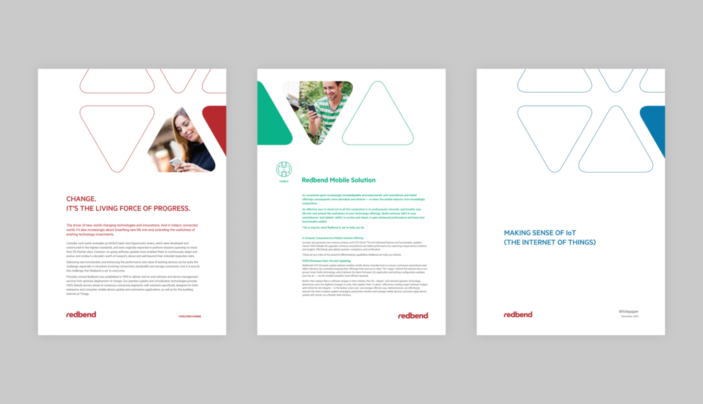
CHANGE. IT’S THE LIVING FORCE OF PROGRESS.
We created a bold, fresh look for Redbend that reflects their innovation and expertise at every touchpoint. The design pulls inspiration from their focus on tech evolution, blending clean, angular shapes with a structured yet fluid layout. It’s a perfect fit for a brand that’s all about adaptability and precision. A standout feature is the triangular design element throughout their marketing materials. It’s all about forward motion and progress, paired with eye-catching fonts and a striking color palette. Everything ties together to give Redbend a strong, recognizable identity across digital and physical platforms. By creating a flexible and scalable design, we equipped Redbend with a brand identity that can grow and evolve alongside their cutting-edge tech, reinforcing their commitment to driving change and innovation.


Discover More Projects
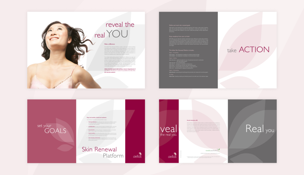
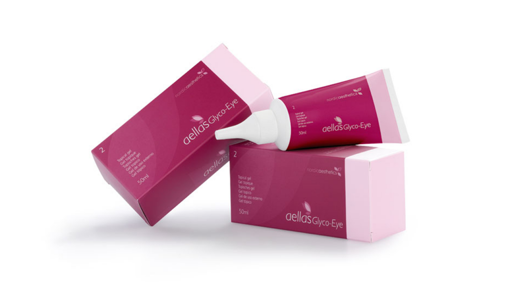
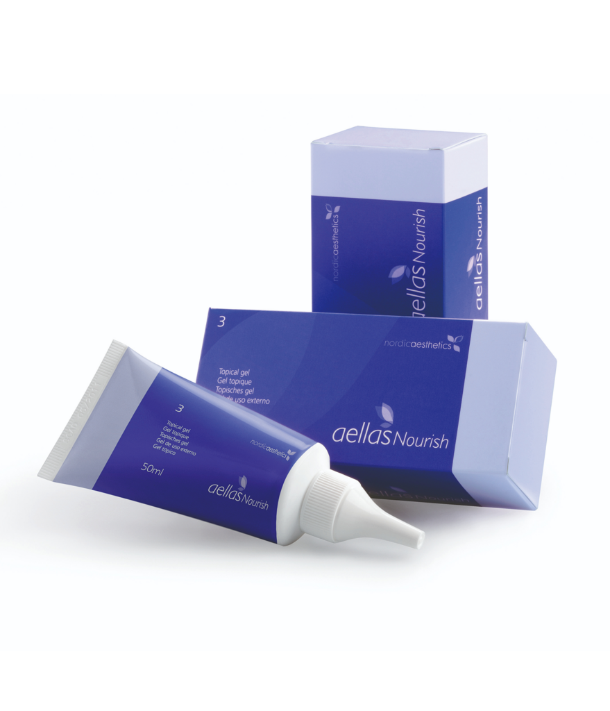
Reveal the real you
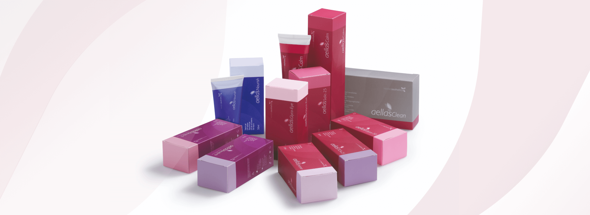
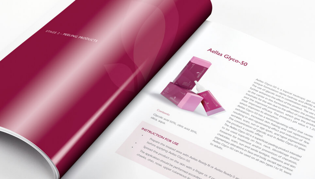
The Aellas™ Skin Renewal Platform transforms chemical peeling with cutting-edge nanotechnology and proven ingredients for a safe, effective, and comfortable experience. Offering tailored peeling solutions for all skin types, plus pre- and post-treatment products, Aellas provides a comprehensive approach to skin renewal. To reflect this blend of luxury and trust, we designed a warm, sophisticated brand identity with earthy tones, clean lines, and elegant typography— positioning Aellas as the go-to for premium skin renewal.
Product Design

Discover More Projects
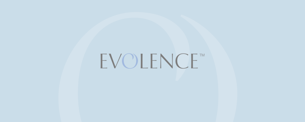
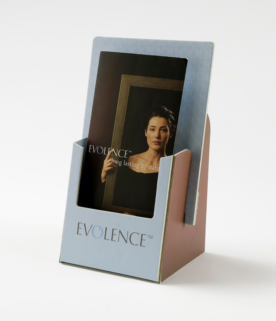
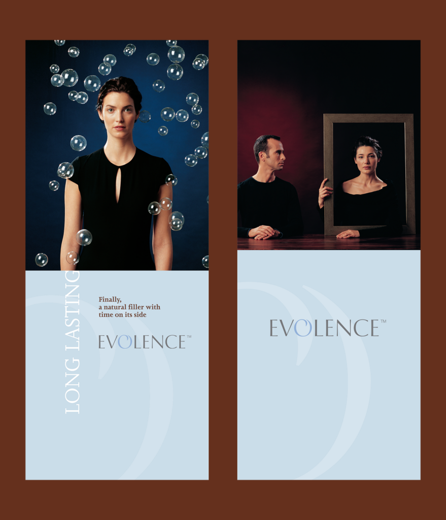
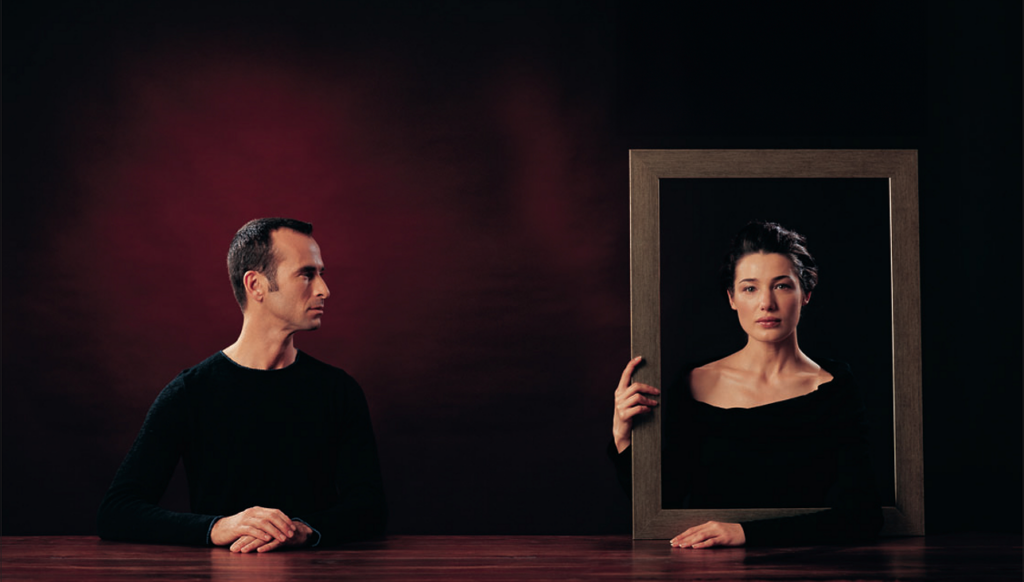
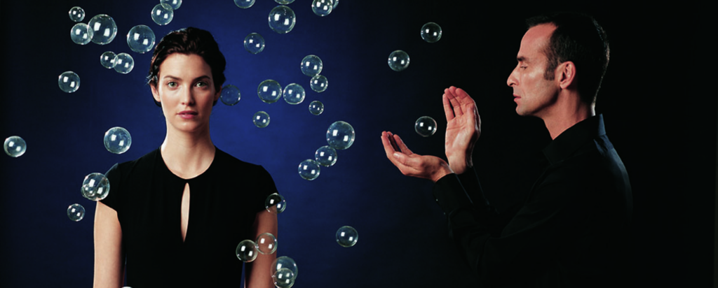
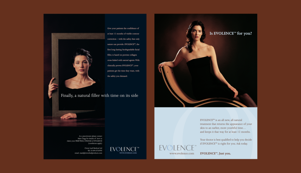
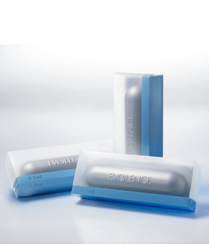
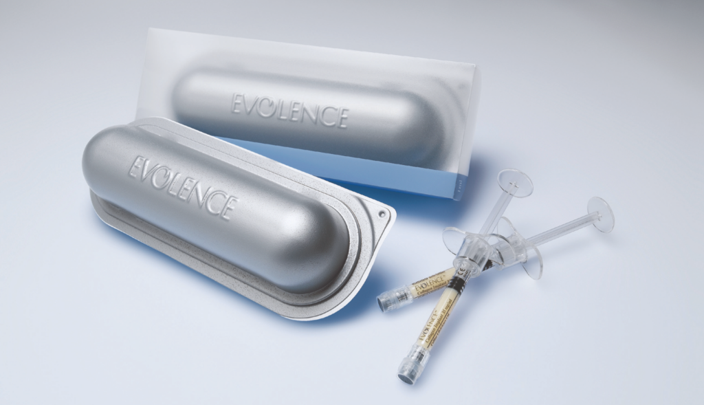
Long Lasting by Nature
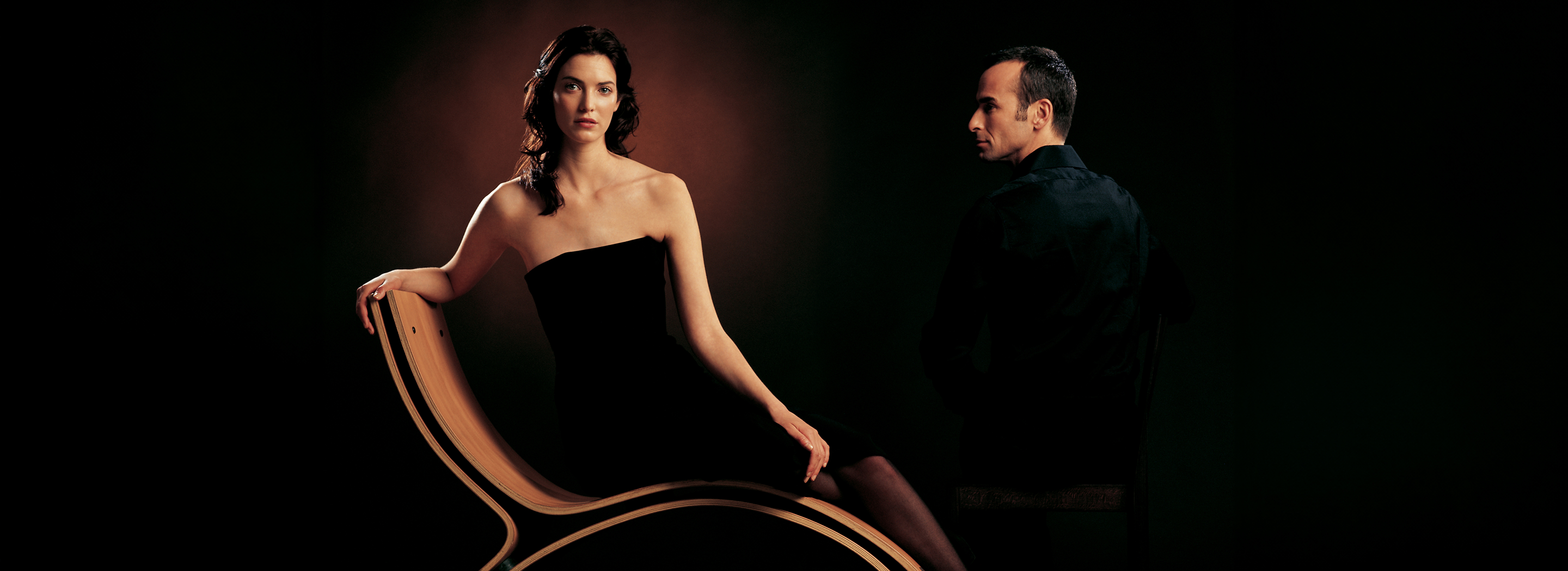
For EVOLENCE™, we crafted a clean, timeless visual identity that highlights the brand’s essence: natural, long-lasting, and elegant. The design celebrates confidence, beauty, and the natural aging process, perfectly aligning with their key message, “Finally, a natural filler with time on its side.” Our inspiration came from bubbles—symbols of lightness and transformation. This idea runs through the logo and photography, with the circular “O” in the logo subtly reinforcing renewal and continuous beauty. We collaborated with renowned photographer Miri Davidovich on a photoshoot that captured the product’s premium feel. Using bold lighting, soft colors, and a minimalist style, we created visuals that exude sophistication and trust. Every design choice—from typography to layout—was made to echo the brand’s promise of safe, natural, and effective results.